Gallery
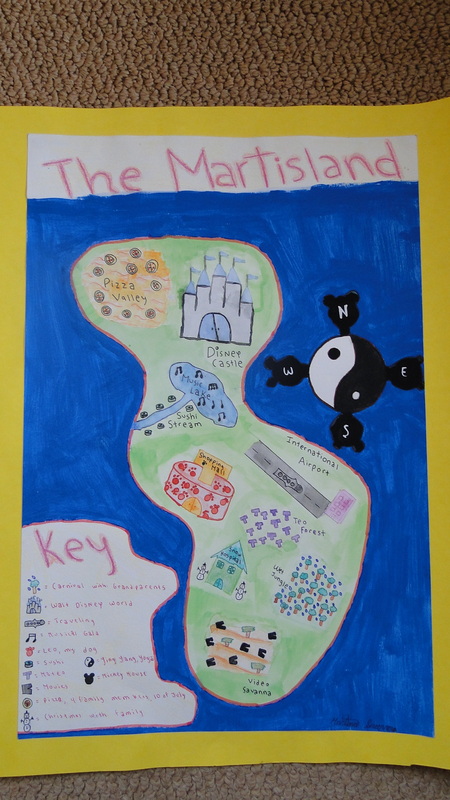
Symbolism Map
About this project:
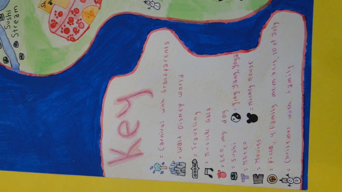
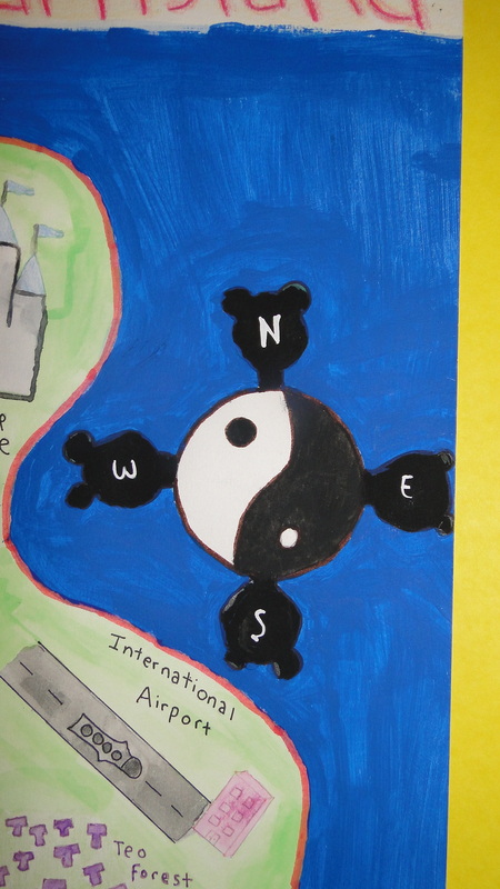
In class we learned about symbolism and its importance both on modern and classic art. The map here is a reflection of my life using symbols and land features. The goal of this map is to understand and apply symbolism. What I did first was answer some questions about my life, and try to draw symbols about each. Then I made a draft about the map in my sketchbook. I colored the draft with color pencils. I tried to copy the same map on an A3 cardboard paper. I did all on pencil first. Then with watercolors I painted the map. I used different techniques for painting all the map. I had to paint the symbols at last, including the compass rose. The key explains what each symbol means. Here is an explanation about the meaning of some symbols:
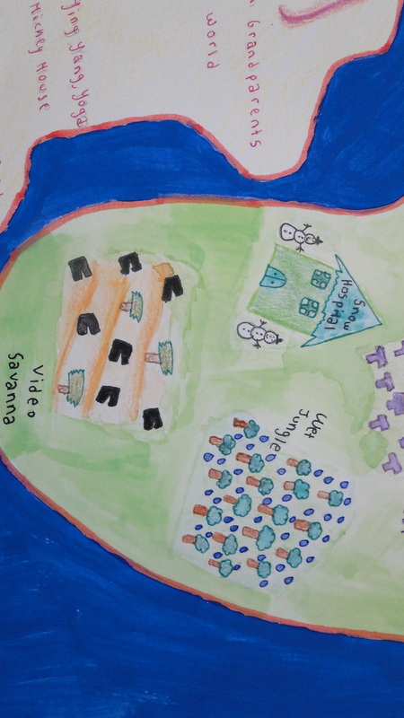
Video Savanna:
This part of my map represents how much I love watching movies on the cinema or at my house.
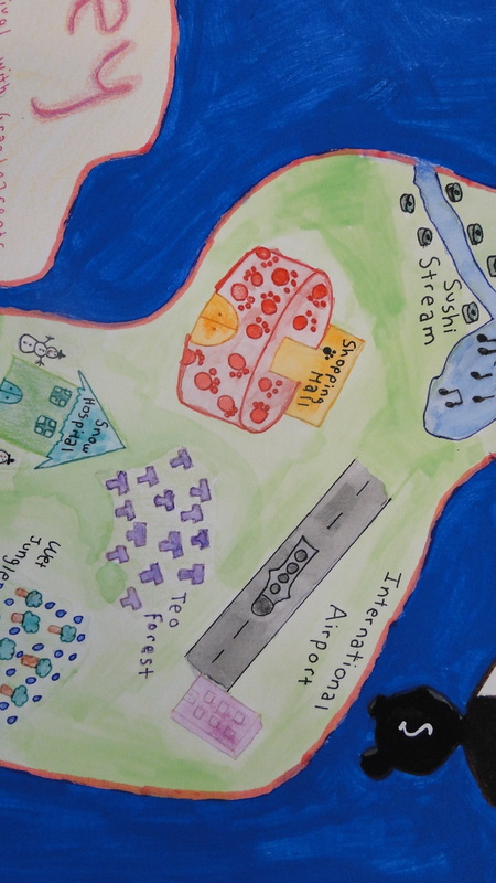
Music Lake:
The music notes represent my love to music. I really like to hear music, and play on the marimba. This symbols also remind me of a Musical Gala I attended once.
Shopping Mall:
This represents how much I love my dog: Leo.
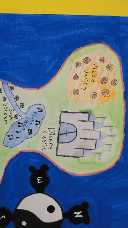
Pizza Valley and Sushi Stream:
This represents my favorite kind of food pizza and sushi. The best food for me in the world.
Disney Castle:
This represents how much I love disney movies and songs. I also love the teaching it left me: dreams come true. It guides many of the aspirations in my life.
The Compass Rose:
This represents two things. First it represents my favorite caricature: Mickey Mouse. It also represents how important I think yoga is for both kids and adults.
Reflection:
I think this project was really interest. I really enjoyed doing it because it was like a self-portrait but represented in land features and symbols. I think the most interesting part of it was deciding what symbols to include in the map, referring to an aspect of my life. I think brainstorming these ideas was the easiest part of the project. Doing and coloring the draft was also easy because it was on a smaller paper and with color pencils. I think the most difficult part was doing the final map. The symbols had to be painted very carefully, and it was difficult to paint them with watercolors because the color went to other parts of the map. I had to paint the symbols with a small paint brush and I had to observe carefully so it would turn out alright. We had to be very cautious doing this map because accidents always happened where water was spilled over the work. What helped me a lot while painting the symbols was a technique called water color pencils. Through this technique I could paint the symbols with watercolor pencils and drop some water over them to make them look better. If I were to do this project again I would try to paint the ocean lighter, because the dark blue maintains people's attention on the ocean instead of on the island, and that is not the objective. Doing this map was fun because I could express myself, my thoughts, my likes and my dreams.
In class we learned about symbolism and its importance both on modern and classic art. The map here is a reflection of my life using symbols and land features. The goal of this map is to understand and apply symbolism. What I did first was answer some questions about my life, and try to draw symbols about each. Then I made a draft about the map in my sketchbook. I colored the draft with color pencils. I tried to copy the same map on an A3 cardboard paper. I did all on pencil first. Then with watercolors I painted the map. I used different techniques for painting all the map. I had to paint the symbols at last, including the compass rose. The key explains what each symbol means. Here is an explanation about the meaning of some symbols:
Video Savanna:
This part of my map represents how much I love watching movies on the cinema or at my house.
Music Lake:
The music notes represent my love to music. I really like to hear music, and play on the marimba. This symbols also remind me of a Musical Gala I attended once.
Shopping Mall:
This represents how much I love my dog: Leo.
Pizza Valley and Sushi Stream:
This represents my favorite kind of food pizza and sushi. The best food for me in the world.
Disney Castle:
This represents how much I love disney movies and songs. I also love the teaching it left me: dreams come true. It guides many of the aspirations in my life.
The Compass Rose:
This represents two things. First it represents my favorite caricature: Mickey Mouse. It also represents how important I think yoga is for both kids and adults.
Reflection:
I think this project was really interest. I really enjoyed doing it because it was like a self-portrait but represented in land features and symbols. I think the most interesting part of it was deciding what symbols to include in the map, referring to an aspect of my life. I think brainstorming these ideas was the easiest part of the project. Doing and coloring the draft was also easy because it was on a smaller paper and with color pencils. I think the most difficult part was doing the final map. The symbols had to be painted very carefully, and it was difficult to paint them with watercolors because the color went to other parts of the map. I had to paint the symbols with a small paint brush and I had to observe carefully so it would turn out alright. We had to be very cautious doing this map because accidents always happened where water was spilled over the work. What helped me a lot while painting the symbols was a technique called water color pencils. Through this technique I could paint the symbols with watercolor pencils and drop some water over them to make them look better. If I were to do this project again I would try to paint the ocean lighter, because the dark blue maintains people's attention on the ocean instead of on the island, and that is not the objective. Doing this map was fun because I could express myself, my thoughts, my likes and my dreams.
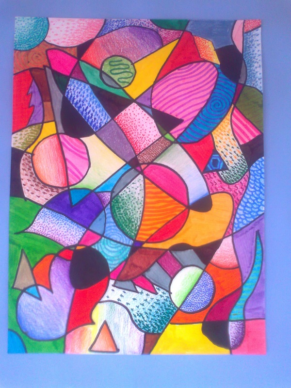
Value Study Project

About this Project:
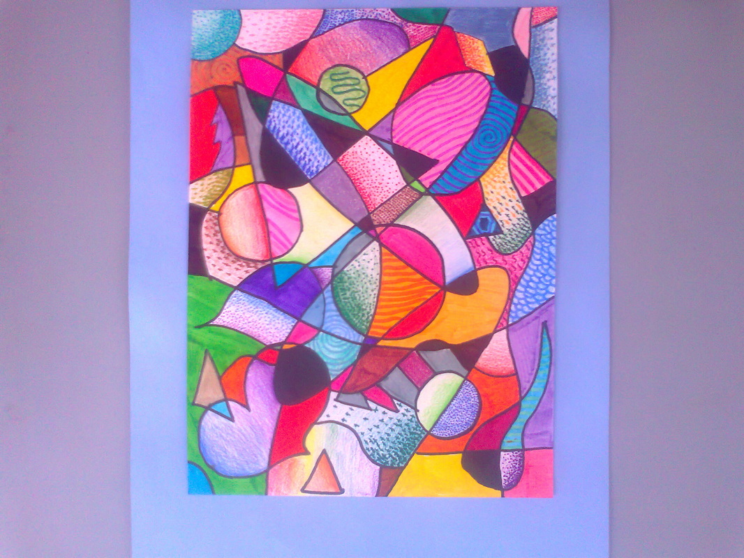
This project was a semester exam for art class. In class we learned about value. Value in art is a range of lightness or darkness. The goal of this project was to practice value using different techniques. In my sketchbook, I made a circle that showed value in black and white, and another one in color. To make the circle look smooth I used a blending stick so that the shapes looked much more real. We learned about three different ways to show value. These were Cross-hatching, Pointillism and Gradation or Smooth Shading. I used these techniques while making the project. Cross-Hatching was making a color blend into another through crosses that gradually disappeared. Pointillism was the same, except it was with points. Gradation was instead with color pencils. This three techniques could gradually change from one color to another one too. For making this project I had to follow some simple instructions such as making 4 curved lines, some circles, triangles and other figures of my preference. Many of these forms overlapped others. Then I had to go over all the figures with a permanent black marker. Finally I had to paint all spaces in a different way. Some of them could be painted black, others had to be painted using gradation, and the resting ones could be painted any way I wanted with markers or color pencils.
Reflection:
I think this project was very fun. I think this because the instruction were all the same but still everyone's result was different. In this kind of projects we can really understand the differences in people and how everyone expresses art in many distinct ways. I think the best part of doing it is making all the figures. This part wasn't just the best it was also the easiest because the directions were simple, and if I made any errors I could erase them. When I finished doing all the forms on pencil, I had to go over them with a permanent black marker. After that, I erased all marks of pencil. This part was easy too. The part that took the longer was to paint all the spaces of the different shapes. This part was the most important part. I had to be very careful not to paint two parts separated by a line the same color. I also had to be very cautious about not using the same color in very close figures. I had to see that each side of the paper had different colors. If I were to repeat it or do it again, I would try to paint all the resting spaces in a more original way. This is because I did spirals for some of them, or painted them completely of one color, but I could have painted them using more colors on one space or with many other figures. However, I like the result of this project and I think it looks very nice.
Clay Head

About this Project:
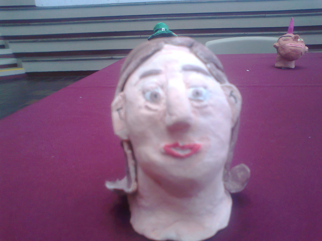
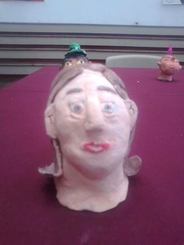
In art class we learned about facial proportion. First of all, proportion is how sizes relate. So facial proportion is how sizes and locations of our facial features relate. I did two different projects for facial proportion: a half-portrait and a clay-head. The goal of this project was to understand and apply facial proportion. The material I used mainly in this project was clay. I had to follow the rules of proportion doing this head. Like for example I had to put the eyes in the middle of the head, the ears in between the distance of the eyes and the nose and the mouth in between the distances of the middle of the eyes. I did this head step by step. First the neck and the head, then the eyes, the eyebrows, the nose and the mouth and finally the ears and the hair. I had to put each feature where it belonged. For the mouth and the eyelid I could use a stick. For the head not to dry I had to use a wet paper towel and a plastic bag. I had to wrap the paper towel over the head, then get it into a plastic bag and close it. I could also use a flat surface for the head not to change of form. When I finished with the head, I had to let it dry. After that, I painted the clay-head with watercolors, and gave the last details to the head such as the pupils and the lines of the ears.
Reflection:
This project was really useful, it taught me important skills. These skills include learning about facial proportion and manipulating clay. I really like this project because it was nothing like the other ones were all we used was a pencil, color pencils and markers. During this project I learned how to manage clay so that it doesn't dry and you can keep changing its form. The easiest part of this project was doing the nose and the ears. This facial features were easy to do. On the other side, the most difficult part of the project was doing the head and the neck. The neck isn't right below our jaw, like we normally draw it. It instead holds the head and if it is seen from the front, it starts from the ears. While painting the head I had to be very neat because the watercolors for the hair went to the face if I wasn't careful enough. I also had to use different sizes of paint brushes, like for example the small one for the lips. If I were to do this head again I would add more details to it. Like for example I would add a hat, some headbands or bows to the hair. I would also add earrings and maybe a necklace. All these could make my clay head look better. I really loved creating this head.
Martina G. 9A
